# Background
You can set the background for a component.
> **NOTE**
>
> The APIs of this module are supported since API version 7. Updates will be marked with a superscript to indicate their earliest API version.
## background10+
background(builder: CustomBuilder, options?: { align?: Alignment })
Sets the background color of the component.
**Atomic service API**: This API can be used in atomic services since API version 11.
**System capability**: SystemCapability.ArkUI.ArkUI.Full
**Parameters**
| Name | Type | Mandatory| Description |
| ------- | ---------------------------------------------------- | ---- | ------------------------------------------------------------ |
| builder | [CustomBuilder](ts-types.md#custombuilder8) | Yes | Custom background. |
| options | {align?:[Alignment](ts-appendix-enums.md#alignment)} | No | Alignment mode between the custom background and the component.
If **background**, **backgroundColor**, and **backgroundImage** are set at the same time, they will all take effect, with **background** at the top layer.|
> **NOTE**
>
> The custom background takes some time to render, during which it cannot respond to events, or be dynamically updated. This attribute cannot be nested or be previewed in the previewer.
## backgroundColor
backgroundColor(value: ResourceColor)
Sets the background color of the component.
**Widget capability**: This API can be used in ArkTS widgets since API version 9.
**Atomic service API**: This API can be used in atomic services since API version 11.
**System capability**: SystemCapability.ArkUI.ArkUI.Full
**Parameters**
| Name| Type | Mandatory| Description |
| ------ | ------------------------------------------ | ---- | ------------------ |
| value | [ResourceColor](ts-types.md#resourcecolor) | Yes | Background color of the component.|
## backgroundImage
backgroundImage(src: ResourceStr | PixelMap, repeat?: ImageRepeat)
Sets the background image of the component.
**Widget capability**: This API can be used in ArkTS widgets since API version 9.
**Atomic service API**: This API can be used in atomic services since API version 11.
**System capability**: SystemCapability.ArkUI.ArkUI.Full
**Parameters**
| Name| Type | Mandatory| Description |
| ------ | ----------------------------------------------- | ---- | ------------------------------------------------------------ |
| src | [ResourceStr](ts-types.md#resourcestr) \| [PixelMap12+](../../apis-image-kit/js-apis-image.md#pixelmap7) | Yes | Image address, which can be the address of an online or local image, a Base64 encoded string, or a pixel map. SVG images are not supported.|
| repeat | [ImageRepeat](ts-appendix-enums.md#imagerepeat) | No | Whether the background image is repeated. By default, the background image is not repeated. If the set image has a transparent background and **backgroundColor** is set, the image is overlaid on the background color.|
## backgroundImageSize
backgroundImageSize(value: SizeOptions | ImageSize)
Sets the width and height of the component background image.
**Widget capability**: This API can be used in ArkTS widgets since API version 9.
**Atomic service API**: This API can be used in atomic services since API version 11.
**System capability**: SystemCapability.ArkUI.ArkUI.Full
**Parameters**
| Name| Type | Mandatory| Description |
| ------ | ------------------------------------------------------------ | ---- | ------------------------------------------------------------ |
| value | [SizeOptions](ts-universal-attributes-size.md#sizeoptions) \| [ImageSize](ts-appendix-enums.md#imagesize) | Yes | Width and height of the background image. If the input is a **{width: Length, height: Length}** object and only one attribute is set, the other attribute is the set value multiplied by the original aspect ratio of the image. By default, the original image aspect ratio remains unchanged.
The value range of **width** and **height** is [0, +∞).
Default value: **ImageSize.Auto**
**NOTE**
A value less than 0 evaluates to the value **0**. If **height** is set but **width** is not, the image width is adjusted based on the original aspect ratio of the image.|
## backgroundImagePosition
backgroundImagePosition(value: Position | Alignment)
Sets the position of the component background image.
**Widget capability**: This API can be used in ArkTS widgets since API version 9.
**Atomic service API**: This API can be used in atomic services since API version 11.
**System capability**: SystemCapability.ArkUI.ArkUI.Full
**Parameters**
| Name| Type | Mandatory| Description |
| ------ | ------------------------------------------------------------ | ---- | ------------------------------------------------------------ |
| value | [Position](ts-types.md#position) \| [Alignment](ts-appendix-enums.md#alignment) | Yes | Position of the background image in the component, that is, the coordinates relative to the upper left corner of the component.
Default value:
{
x: 0,
y: 0
}
When **x** and **y** are set in percentage, the offset is calculated based on the width and height of the component.|
## BlurStyle9+
**Widget capability**: This API can be used in ArkTS widgets since API version 9.
**System capability**: SystemCapability.ArkUI.ArkUI.Full
| Name | Description |
| -------------------- | --------- |
| Thin | Thin material.
**Atomic service API**: This API can be used in atomic services since API version 11. |
| Regular | Regular material.
**Atomic service API**: This API can be used in atomic services since API version 11.|
| Thick | Thick material.
**Atomic service API**: This API can be used in atomic services since API version 11. |
| BACKGROUND_THIN | Material that creates the minimum depth of field effect.
**Atomic service API**: This API can be used in atomic services since API version 11. |
| BACKGROUND_REGULAR | Material that creates a medium shallow depth of field effect.
**Atomic service API**: This API can be used in atomic services since API version 11. |
| BACKGROUND_THICK | Material that creates a high shallow depth of field effect.
**Atomic service API**: This API can be used in atomic services since API version 11. |
| BACKGROUND_ULTRA_THICK | Material that creates the maximum depth of field effect.
**Atomic service API**: This API can be used in atomic services since API version 11. |
| NONE10+ | No blur.
**Atomic service API**: This API can be used in atomic services since API version 11. |
| COMPONENT_ULTRA_THIN11+ | Component ultra-thin material.
**Atomic service API**: This API can be used in atomic services since API version 12.|
| COMPONENT_THIN11+ | Component thin material.
**Atomic service API**: This API can be used in atomic services since API version 12.|
| COMPONENT_REGULAR11+ | Component regular material.
**Atomic service API**: This API can be used in atomic services since API version 12.|
| COMPONENT_THICK11+ | Component thick material.
**Atomic service API**: This API can be used in atomic services since API version 12.|
| COMPONENT_ULTRA_THICK11+ | Component ultra-thick material.
**Atomic service API**: This API can be used in atomic services since API version 12.|
## backgroundBlurStyle9+
backgroundBlurStyle(value: BlurStyle, options?: BackgroundBlurStyleOptions)
Sets the background blur style applied between the content and the background.
**Widget capability**: This API can be used in ArkTS widgets since API version 9.
**Atomic service API**: This API can be used in atomic services since API version 11.
**System capability**: SystemCapability.ArkUI.ArkUI.Full
**Parameters**
| Name | Type | Mandatory| Description |
| --------------------- | ------------------------------------------------------------ | ---- | ------------------------------------------------------------ |
| value | [BlurStyle](#blurstyle9) | Yes | Settings of the background blur style, including the blur radius, mask color, mask opacity, saturation, and brightness.|
| options10+ | [BackgroundBlurStyleOptions](#backgroundblurstyleoptions10)| No | Background blur options. |
## backgroundEffect11+
backgroundEffect(options: BackgroundEffectOptions)
Sets the background effect of the component.
**Atomic service API**: This API can be used in atomic services since API version 11.
**System capability**: SystemCapability.ArkUI.ArkUI.Full
**Parameters**
| Name | Type | Mandatory| Description |
| ------- | ------------------------------------------------------------ | ---- | ------------------------------------------ |
| options | [BackgroundEffectOptions](#backgroundeffectoptions11) | Yes | Background effect, including saturation, brightness, and color.|
## BackgroundEffectOptions11+
Describes the background effect.
**Atomic service API**: This API can be used in atomic services since API version 12.
**System capability**: SystemCapability.ArkUI.ArkUI.Full
| Name | Type | Mandatory| Description |
| ---- | ---- | ---- | -------------------------- |
| radius | number | Yes | Blur radius.
Value range: [0, +∞)
Default value: **0** |
| saturation | number | No | Saturation.
Value range: [0, +∞)
Default value: **1** Recommended value range: [0, 50] |
| brightness | number | No | Brightness.
Value range: [0, +∞)
Default value: **1** Recommended value range: [0, 2]|
| color | [Color](ts-appendix-enums.md#color) | No | Color.
Default value: transparent |
| adaptiveColor | [AdaptiveColor](ts-universal-attributes-foreground-blur-style.md#adaptivecolor10) | No | Adaptive color mode used for the background blur effect.
Default value: **DEFAULT** When set to **AVERAGE**, the adaptive color mode takes effect only when the color has transparency. |
| blurOptions | [BlurOptions](ts-universal-attributes-foreground-blur-style.md#bluroptions11) | No | Grayscale blur.
Default value: **[0, 0]** |
| policy | [BlurStyleActivePolicy](ts-appendix-enums.md#blurstyleactivepolicy13) | No | Blur activation policy.
Default value: **FOLLOWS_WINDOW_ACTIVE_STATE**
|
| inactiveColor | ResourceColor | No | Background color of the components within the window after the window loses focus (in which case, the blur effect on the components within the window is removed).
|
| type | [BlurType](ts-appendix-enums.md#blurtype13) | No | Blur type.
Default value: **WITHIN_WINDOW**
|
## backgroundImageResizable12+
backgroundImageResizable(value: ResizableOptions)
Sets the resizable background image options.
When **ResizableOptions** is set to a valid value, the **repeat** parameter in [backgroundImage](#backgroundimage) does not take effect.
When the sum of the values of **top** and **bottom** is greater than the source image height, or the sum of the values of **left** and **right** is greater than the source image width, the **ResizableOptions** attribute does not take effect.
**Atomic service API**: This API can be used in atomic services since API version 12.
**System capability**: SystemCapability.ArkUI.ArkUI.Full
**Parameters**
| Name| Type | Mandatory| Description |
| ------ | --------------------------------------- | ---- | -------------------------------- |
| value | [ResizableOptions](ts-basic-components-image.md#resizableoptions11) | Yes | Resizable image options.|
## BackgroundBlurStyleOptions10+
Inherited from [BlurStyleOptions](ts-universal-attributes-foreground-blur-style.md).
**Atomic service API**: This API can be used in atomic services since API version 13.
| Name| Type | Mandatory| Description |
| ------ | ------------------------------------------------------------ | ---- | ---------------------------------------------------- |
| policy | [BlurStyleActivePolicy](ts-appendix-enums.md#blurstyleactivepolicy13) | No | Blur activation policy.
Default value: **FOLLOWS_WINDOW_ACTIVE_STATE**
|
| inactiveColor | ResourceColor | No | Background color of the components within the window after the window loses focus (in which case, the blur effect on the components within the window is removed).
|
| type | [BlurType](ts-appendix-enums.md#blurtype13) | No | Blur type.
Default value: **WITHIN_WINDOW**
|
## backgroundBrightness12+
backgroundBrightness(params: BackgroundBrightnessOptions)
Sets the background brightness of the component.
**Atomic service API**: This API can be used in atomic services since API version 12.
**System capability**: SystemCapability.ArkUI.ArkUI.Full
**Parameters**
| Name| Type | Mandatory| Description |
| ------ | ------------------------------------------------------------ | ---- | ---------------------------------------------------- |
| params | [BackgroundBrightnessOptions](#backgroundbrightnessoptions12) | Yes | Parameters for setting the background brightness.|
## BackgroundBrightnessOptions12+
**Atomic service API**: This API can be used in atomic services since API version 12.
| Name | Type | Mandatory | Description |
| ------------- | ---------------------------------------- | ---- | ---------------------------------------- |
| rate | number | Yes | Brightness change rate. A larger change rate indicates a faster decrease and slower increase in brightness.
Default value: **0.0**
Value range: (0.0, +∞)
|
| lightUpDegree | number | Yes | Light up degree. A greater degree indicates a greater increase in brightness.
Default value: **0.0**
Value range: [-1.0, 1.0]
|
## Example
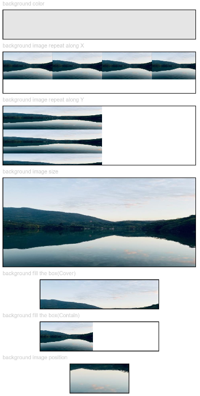
### Example 1
```ts
// xxx.ets
@Entry
@Component
struct BackgroundExample {
build() {
Column({ space: 5 }) {
Text('background color').fontSize(9).width('90%').fontColor(0xCCCCCC)
Row().width('90%').height(50).backgroundColor(0xE5E5E5).border({ width: 1 })
Text('background image repeat along X').fontSize(9).width('90%').fontColor(0xCCCCCC)
Row()
.backgroundImage('/comment/bg.jpg', ImageRepeat.X)
.backgroundImageSize({ width: '250px', height: '140px' })
.width('90%')
.height(70)
.border({ width: 1 })
Text('background image repeat along Y').fontSize(9).width('90%').fontColor(0xCCCCCC)
Row()
.backgroundImage('/comment/bg.jpg', ImageRepeat.Y)
.backgroundImageSize({ width: '500px', height: '120px' })
.width('90%')
.height(100)
.border({ width: 1 })
Text('background image size').fontSize(9).width('90%').fontColor(0xCCCCCC)
Row()
.width('90%').height(150)
.backgroundImage('/comment/bg.jpg', ImageRepeat.NoRepeat)
.backgroundImageSize({ width: 1000, height: 500 })
.border({ width: 1 })
Text('background fill the box(Cover)').fontSize(9).width('90%').fontColor(0xCCCCCC)
// Occupy all the space of the container, without ensuring that the image is completely displayed.
Row()
.width(200)
.height(50)
.backgroundImage('/comment/bg.jpg', ImageRepeat.NoRepeat)
.backgroundImageSize(ImageSize.Cover)
.border({ width: 1 })
Text('background fill the box(Contain)').fontSize(9).width('90%').fontColor(0xCCCCCC)
// Maximize the image while ensuring that it can be completely displayed.
Row()
.width(200)
.height(50)
.backgroundImage('/comment/bg.jpg', ImageRepeat.NoRepeat)
.backgroundImageSize(ImageSize.Contain)
.border({ width: 1 })
Text('background image position').fontSize(9).width('90%').fontColor(0xCCCCCC)
Row()
.width(100)
.height(50)
.backgroundImage('/comment/bg.jpg', ImageRepeat.NoRepeat)
.backgroundImageSize({ width: 1000, height: 560 })
.backgroundImagePosition({ x: -500, y: -300 })
.border({ width: 1 })
}
.width('100%').height('100%').padding({ top: 5 })
}
}
```
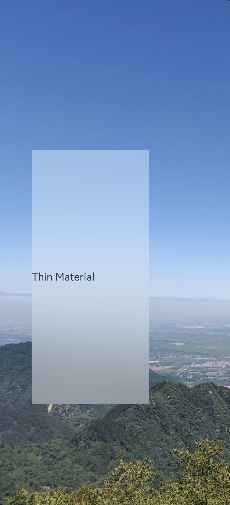
### Example 2
```ts
// xxx.ets
@Entry
@Component
struct BackgroundBlurStyleDemo {
build() {
Column() {
Row() {
Text("Thin Material")
}
.width('50%')
.height('50%')
.backgroundBlurStyle(BlurStyle.Thin, { colorMode: ThemeColorMode.LIGHT, adaptiveColor: AdaptiveColor.DEFAULT, scale: 1.0 })
.position({ x: '15%', y: '30%' })
}
.height('100%')
.width('100%')
.backgroundImage($r('app.media.bg'))
.backgroundImageSize(ImageSize.Cover)
}
}
```
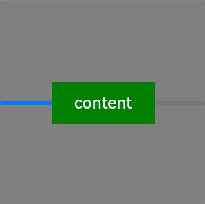
### Example 3
```ts
// xxx.ets
@Entry
@Component
struct BackgroundExample {
@Builder renderBackground() {
Column() {
Progress({value : 50})
}
}
build() {
Column() {
Text("content")
.width(100)
.height(40)
.fontColor("#FFF")
.position({x:50, y:80})
.textAlign(TextAlign.Center)
.backgroundColor(Color.Green)
}
.width(200).height(200)
.background(this.renderBackground)
.backgroundColor(Color.Gray)
}
}
```
### Example 4
This example shows how to set the background brightness for the component.
```ts
// xxx.ets
@Entry
@Component
struct BackgroundBrightnessDemo {
build() {
Column() {
Row() {
Text("BackgroundBrightness")
}
.width(200)
.height(100)
.position({ x: 100, y: 100 })
.backgroundBlurStyle(BlurStyle.Thin, { colorMode: ThemeColorMode.LIGHT, adaptiveColor: AdaptiveColor.DEFAULT})
.backgroundBrightness({rate:0.5,lightUpDegree:0.5}) // Background brightness
}
.width('100%')
.height('100%')
.backgroundImage($r('app.media.image'))
.backgroundImageSize(ImageSize.Cover)
}
}
```
The following figures show how the component looks with the background brightness set.
When **rate** and **lightUpDegree** are both set to **0.5**
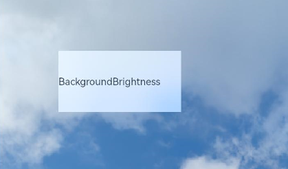
When **rate** is set to **0.5** and **lightUpDegree** **-0.1**

The following figure shows how the component looks without the background brightness set.
