# ToolBar
The **Toolbar** component is used to host a set of action options related to the current screen, displayed at the bottom of the screen. It can display five child components. When there are six or more child components, the first four are displayed and the others are moved to the **More** option on the toolbar.
> **NOTE**
>
> This component is supported since API version 10. Updates will be marked with a superscript to indicate their earliest API version.
## Modules to Import
```
import { ToolBar, ToolBarOptions, toolBarModifier, ItemState } from '@kit.ArkUI'
```
## Child Components
Not supported
## Attributes
The [universal attributes](ts-universal-attributes-size.md) are supported.
## ToolBar
Toolbar({toolBarList: ToolBarOptions, activateIndex?: number, controller: TabsController, dividerModifier: DividerModifier, toolBarModifier: ToolBarModifier})
**Decorator**: @Component
**Atomic service API**: This API can be used in atomic services since API version 11.
**System capability**: SystemCapability.ArkUI.ArkUI.Full
**Parameters**
| Name | Type | Mandatory | Decorator | Description |
|-------------------------------|-----------------------------------------------------------|-----|-------------|------------------------------------------------------------------------------------------------------|
| toolBarList | [ToolBarOptions](#toolbaroptions) | Yes | @ObjectLink | Toolbar list. |
| activateIndex | number | No | @Prop | Index of the active option.
Default value: **-1** |
| controller | [TabsController](ts-container-tabs.md#tabscontroller) | Yes | - | Toolbar controller. |
| dividerModifier13+ | [DividerModifier](ts-universal-attributes-attribute-modifier.md) | No | @Prop | Modifier for the toolbar header divider, which can be used to customize the divider's height, color, and other attributes.
**Atomic service API**: This API can be used in atomic services since API version 13. |
| toolBarModifier13+ | [ToolBarModifier](#toolbarmodifier13) | No | @Prop | Modifier for the toolbar, which can be used to set the toolbar's height, background color, padding (which only takes effect when there are fewer than five toolbar items), and whether to display the pressed state.
**Atomic service API**: This API can be used in atomic services since API version 13.|
## ToolBarOptions
Inherits from **Array<[ToolBarOption](#toolbaroption)>**.
**Atomic service API**: This API can be used in atomic services since API version 11.
## ToolBarOption
| Name | Type | Mandatory| Description |
|------------------------------------|-----------------------------------------------------------| -------- |--------------------------------------------------------------------------------------------------------------|
| content | [ResourceStr](ts-types.md#resourcestr) | Yes| Text of the toolbar option.
**Atomic service API**: This API can be used in atomic services since API version 11. |
| action | () => void | No| Click event of the toolbar option.
**Atomic service API**: This API can be used in atomic services since API version 11. |
| icon | [Resource](ts-types.md#resource) | No| Icon of the toolbar option.
If **toolBarSymbolOptions** has input parameters, **icon** is ineffective.
**Atomic service API**: This API can be used in atomic services since API version 11. |
| state | [ItemState](#itemstate) | No| State of the toolbar option.
Default value: **ENABLE**
**Atomic service API**: This API can be used in atomic services since API version 11. |
| iconColor13+ | [ResourceColor](ts-types.md#resourcecolor) | No| Icon fill color of the toolbar option.
Default value: **$r('sys.color.icon_primary')**
**Atomic service API**: This API can be used in atomic services since API version 13. |
| activatedIconColor13+ | [ResourceColor](ts-types.md#resourcecolor) | No| Icon fill color of the toolbar option in the activated state.
Default value: **$r('sys.color.icon_emphasize')**
**Atomic service API**: This API can be used in atomic services since API version 13.|
| textColor13+ | [ResourceColor](ts-types.md#resourcecolor) | No| Font color of the toolbar option.
Default value: **$r('sys.color.font_primary')**
**Atomic service API**: This API can be used in atomic services since API version 13. |
| activatedTextColor13+ | [ResourceColor](ts-types.md#resourcecolor) | No| Font color of the toolbar option in the activated state.
Default value: **$r('sys.color.font_emphasize')**
**Atomic service API**: This API can be used in atomic services since API version 13. |
| toolBarSymbolOptions13+ | [ToolBarSymbolGlyphOptions](#toolbarsymbolglyphoptions13) | No| Icon symbol options of the toolbar option.
**Atomic service API**: This API can be used in atomic services since API version 13. |
## ToolBarModifier13+
Provides APIs for setting the toolbar's height (**height**), background color (**backgroundColor**), left and right padding (**padding**, which only takes effect when there are fewer than five items), and whether to display the pressed state (**stateEffect**).
**Atomic service API**: This API can be used in atomic services since API version 13.
### backgroundColor
backgroundColor?(backgroundColor: ResourceColor): ToolBarModifier
Sets the background color of the toolbar. By overriding this API, you can implement custom drawing for the background color of the toolbar.
**Atomic service API**: This API can be used in atomic services since API version 13.
**System capability**: SystemCapability.ArkUI.ArkUI.Full
**Parameters**
| Name | Type | Mandatory| Description |
| ------- | ------------------------------------------------------ | ---- |------------------------------------------------------------------|
| backgroundColor | [ResourceColor](ts-types.md#resourcecolor) | Yes | Toolbar background color
Default value: **$r('sys.color.ohos_id_color_toolbar_bg')**|
### padding
padding(padding: LengthMetrics): ToolBarModifier
Sets the left and right padding of the toolbar. By overriding this API, you can implement custom drawing for the left and right padding of the toolbar.
**Atomic service API**: This API can be used in atomic services since API version 13.
**System capability**: SystemCapability.ArkUI.ArkUI.Full
**Parameters**
| Name | Type | Mandatory| Description |
| ------- |--------| ---- |-------------------------------------------------------------------------------------|
| padding | [LengthMetrics](../js-apis-arkui-graphics.md#lengthmetrics12)12+ | Yes | Left and right padding of the toolbar, which is effective only when there are fewer than five items.
By default, the padding is 24 vp when there are fewer than five items and 0 when there are five or more items.|
### height
height(height: LengthMetrics): ToolBarModifier
Sets the height of the toolbar. By overriding this API, you can implement custom drawing for the height of the toolbar, which does not include the height of the divider.
**Atomic service API**: This API can be used in atomic services since API version 13.
**System capability**: SystemCapability.ArkUI.ArkUI.Full
**Parameters**
| Name | Type | Mandatory| Description |
| ------- |---------------------------------| ---- |------------------------------------|
| height | [LengthMetrics](../js-apis-arkui-graphics.md#lengthmetrics12)12+ | Yes | Height of the toolbar.
The default height of the toolbar is 56 vp, which does not include the divider.|
### stateEffect
stateEffect(stateEffect: boolean): ToolBarModifier
Sets whether to display the pressed state effect.
**Atomic service API**: This API can be used in atomic services since API version 13.
**System capability**: SystemCapability.ArkUI.ArkUI.Full
**Parameters**
| Name | Type | Mandatory| Description |
| ------- |--------------------------------| ---- |----------------------------------------------------------|
| stateEffect | boolean | Yes | Whether to display the pressed state effect on the toolbar.
The value **true** means to display the pressed state effect on the toolbar, and **false** means the opposite.
Default value: **true**|
## ItemState
**Atomic service API**: This API can be used in atomic services since API version 11.
| Name| Value| Description|
| -------- | -------- | -------- |
| ENABLE | 1 | The toolbar option is enabled.|
| DISABLE | 2 | The toolbar option is disabled.|
| ACTIVATE | 3 | The toolbar option is activated.|
## ToolBarSymbolGlyphOptions13+
Defines the icon symbol options.
**Atomic service API**: This API can be used in atomic services since API version 13.
**System capability**: SystemCapability.ArkUI.ArkUI.Full
| Name | Type | Mandatory| Description |
| ------ | ---------- | ---- |------------------------------------------------------------------------------------------|
| normal | [SymbolGlyphModifier](ts-universal-attributes-attribute-modifier.md) | No | Icon symbol of the toolbar option in normal state.
Default value: **fontColor: $r('sys.color.icon_primary'), fontSize: 24vp** |
| activated| [SymbolGlyphModifier](ts-universal-attributes-attribute-modifier.md) | No | Icon symbol of the toolbar option in activated state.
Default value: **fontColor: $r('sys.color.icon_emphasize'), fontSize: 24vp**|
## Events
The [universal events](ts-universal-events-click.md) are supported.
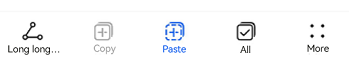
## Example
```ts
import { ToolBar, ToolBarOptions, ItemState } from '@kit.ArkUI'
@Entry
@Component
struct Index {
@State toolbarList: ToolBarOptions = new ToolBarOptions()
aboutToAppear() {
this.toolbarList.push({
content:'Cut Super Long Text',
icon: $r('sys.media.ohos_ic_public_share'),
action: () => {
},
})
this.toolbarList.push({
content: 'Copy',
icon: $r('sys.media.ohos_ic_public_copy'),
action: () => {
},
state:ItemState.DISABLE
})
this.toolbarList.push({
content: 'Paste',
icon: $r('sys.media.ohos_ic_public_paste'),
action: () => {
},
state:ItemState.ACTIVATE
})
this.toolbarList.push({
content:'Select All',
icon: $r('sys.media.ohos_ic_public_select_all'),
action: () => {
},
})
this.toolbarList.push({
content: 'Share',
icon: $r('sys.media.ohos_ic_public_share'),
action: () => {
},
})
this.toolbarList.push({
content: 'Share',
icon: $r('sys.media.ohos_ic_public_share'),
action: () => {
},
})
}
build() {
Row() {
Stack() {
Column() {
ToolBar({
activateIndex: 2,
toolBarList: this.toolbarList,
})
}
}.align(Alignment.Bottom)
.width('100%').height('100%')
}
}
}
```
```ts
import { SymbolGlyphModifier, DividerModifier, ToolBar, ToolBarOptions, ToolBarModifier, ItemState, LengthMetrics } from '@kit.ArkUI';
@Entry
@Component
struct Index {
@State toolbarList: ToolBarOptions = new ToolBarOptions();
@State toolBarModifier: ToolBarModifier =
new ToolBarModifier().height(LengthMetrics.vp(52)).backgroundColor(Color.Transparent).stateEffect(false);
@State dividerModifier: DividerModifier = new DividerModifier().height(0);
aboutToAppear() {
this.toolbarList.push({
content: 'Long long long long long long long long text',
icon: $r('sys.media.ohos_ic_public_share'),
action: () => {
},
state: ItemState.ACTIVATE,
toolBarSymbolOptions: {
normal: new SymbolGlyphModifier($r('sys.symbol.ohos_star')).fontColor([Color.Green]),
activated: new SymbolGlyphModifier($r('sys.symbol.ohos_star')).fontColor([Color.Red]),
},
activatedTextColor: $r('sys.color.font_primary'),
})
this.toolbarList.push({
content: 'Copy',
icon: $r('sys.media.ohos_ic_public_copy'),
action: () => {
},
state:ItemState.DISABLE,
iconColor: '#ff18cb53',
activatedIconColor: '#ffec5d5d',
activatedTextColor: '#ffec5d5d',
})
this.toolbarList.push({
content: 'Paste',
icon: $r('sys.media.ohos_ic_public_paste'),
action: () => {
},
state:ItemState.ACTIVATE,
textColor: '#ff18cb53',
})
this.toolbarList.push({
content: 'All',
icon: $r('sys.media.ohos_ic_public_select_all'),
action: () => {
},
state:ItemState.ACTIVATE,
})
this.toolbarList.push({
content: 'Share',
icon: $r('sys.media.ohos_ic_public_share'),
action: () => {
},
})
this.toolbarList.push({
content: 'Share',
icon: $r('sys.media.ohos_ic_public_share'),
action: () => {
},
})
}
build() {
Row() {
Stack() {
Column() {
ToolBar({
toolBarModifier: this.toolBarModifier,
dividerModifier: this.dividerModifier,
activateIndex: 0,
toolBarList: this.toolbarList,
})
.height(52)
}
}.align(Alignment.Bottom)
.width('100%').height('100%')
}
}
}
```