# Dialog
The dialog box is a modal window that commands attention while retaining the current context. It is frequently used to draw the user's attention to vital information or prompt the user to complete a specific task. As all modal windows, this component requires the user to interact before exiting.
> **NOTE**
>
> This component is supported since API version 10. Updates will be marked with a superscript to indicate their earliest API version.
## Modules to Import
```
import { TipsDialog, SelectDialog, ConfirmDialog, AlertDialog, LoadingDialog, CustomContentDialog } from '@kit.ArkUI'
```
## Child Components
Not supported
## Attributes
The [universal attributes](ts-universal-attributes-size.md) are not supported.
## TipsDialog
TipsDialog({controller: CustomDialogController, imageRes: Resource, imageSize?: SizeOptions, title?: ResourceStr, content?: ResourceStr, checkTips?: ResourceStr, ischecked?: boolean, checkAction?: (isChecked: boolean) => void, primaryButton?: ButtonOptions, secondaryButton?: ButtonOptions})
Displays an image-attached confirmation dialog box. If necessary, the confirmation dialog box can be displayed in a graphical manner.
**Decorator type**: @CustomDialog
**System capability**: SystemCapability.ArkUI.ArkUI.Full
**Parameters**
| Name | Type | Mandatory| Decorator| Description |
| ----------------------------- | ------------------------------------------------------------ | ---- | ---------- | ------------------------------------------------------------ |
| controller | [CustomDialogController](ts-methods-custom-dialog-box.md#customdialogcontroller) | Yes | - | Dialog box controller.
**Atomic service API**: This API can be used in atomic services since API version 11.|
| imageRes | [ResourceStr12+](ts-types.md#resourcestr) \| [PixelMap12+](../../apis-image-kit/js-apis-image.md#pixelmap7) | Yes | - | Image to be displayed.
**Atomic service API**: This API can be used in atomic services since API version 11.|
| imageSize | [SizeOptions](ts-types.md#sizeoptions) | No | - | Image size.
Default value: **64*64vp**
**Atomic service API**: This API can be used in atomic services since API version 11.|
| title | [ResourceStr](ts-types.md#resourcestr) | No | - | Title of the dialog box.
**Atomic service API**: This API can be used in atomic services since API version 11.|
| content | [ResourceStr](ts-types.md#resourcestr) | No | - | Content of the dialog box.
**Atomic service API**: This API can be used in atomic services since API version 11.|
| checkTips | [ResourceStr](ts-types.md#resourcestr) | No | - | Content of the check box.
**Atomic service API**: This API can be used in atomic services since API version 11.|
| isChecked | boolean | No | \@Prop | Whether to select the check box. The value **true** means to select the checkbox , and **false** means the opposite.
Default value: **false**
**Atomic service API**: This API can be used in atomic services since API version 11.|
| checkAction12+ | (isChecked: boolean) => void | No | - | Event triggered when the selected status of the check box changes. You are advised to use **onCheckedChange12+** instead.
**Atomic service API**: This API can be used in atomic services since API version 12. |
| onCheckedChange12+ | Callback\ | No | - | Event triggered when the selected status of the check box changes.
**Atomic service API**: This API can be used in atomic services since API version 12. |
| primaryButton | [ButtonOptions](#buttonoptions) | No | - | Left button of the dialog box.
**Atomic service API**: This API can be used in atomic services since API version 11.|
| secondaryButton | [ButtonOptions](#buttonoptions) | No | - | Right button of the dialog box.
**Atomic service API**: This API can be used in atomic services since API version 11.|
| theme12+ | [Theme](../js-apis-arkui-theme.md#theme) \| [CustomTheme](../js-apis-arkui-theme.md#customtheme) | No | - | Theme information, which can be a custom theme or a **Theme** instance obtained from **onWillApplyTheme**.
**Atomic service API**: This API can be used in atomic services since API version 12.|
## SelectDialog
SelectDialog({controller: CustomDialogController, title: ResourceStr, content?: ResourceStr, selectedIndex?: number, confirm?: ButtonOptions, radioContent: Array<SheetInfo>})
Displays a dialog box from which the user can select options presented in a list or grid.
**Decorator type**: @CustomDialog
**System capability**: SystemCapability.ArkUI.ArkUI.Full
**Parameters**
| Name | Type | Mandatory| Description |
| ------------------- | ------------------------------------------------------------ | ---- | ------------------------------------------------------------ |
| controller | [CustomDialogController](ts-methods-custom-dialog-box.md#customdialogcontroller) | Yes | Dialog box controller.
**Atomic service API**: This API can be used in atomic services since API version 11.|
| title | [ResourceStr](ts-types.md#resourcestr) | Yes | Title of the dialog box.
**Atomic service API**: This API can be used in atomic services since API version 11.|
| content | [ResourceStr](ts-types.md#resourcestr) | No | Content of the dialog box.
**Atomic service API**: This API can be used in atomic services since API version 11.|
| selectedIndex | number | No | Index of the selected option in the dialog box.
Default value: **-1**
**Atomic service API**: This API can be used in atomic services since API version 11.|
| confirm | [ButtonOptions](#buttonoptions) | No | Button at the bottom of the dialog box.
**Atomic service API**: This API can be used in atomic services since API version 11.|
| radioContent | Array<[SheetInfo](ts-methods-action-sheet.md#sheetinfo)> | Yes | List of subitems in the dialog box. You can set text and a select callback for each subitem.
**Atomic service API**: This API can be used in atomic services since API version 11.|
| theme12+ | [Theme](../js-apis-arkui-theme.md#theme) \| [CustomTheme](../js-apis-arkui-theme.md#customtheme) | No | Theme information, which can be a custom theme or a **Theme** instance obtained from **onWillApplyTheme**.
**Atomic service API**: This API can be used in atomic services since API version 12.|
## ConfirmDialog
ConfirmDialog({controller: CustomDialogController, title: ResourceStr, content?: ResourceStr, checkTips?: ResourceStr, ischecked?: boolean, primaryButton?: ButtonOptions, secondaryButton?: ButtonOptions})
Displays an error dialog box that informs the user of an operational error (for example, a network error or low battery level) or an incorrect operation (for example, fingerprint enrollment).
**Decorator type**: @CustomDialog
**System capability**: SystemCapability.ArkUI.ArkUI.Full
**Parameters**
| Name | Type | Mandatory| Decorator| Description |
| ----------------------------- | ------------------------------------------------------------ | ---- | ---------- | ------------------------------------------------------------ |
| controller | [CustomDialogController](ts-methods-custom-dialog-box.md#customdialogcontroller) | Yes | - | Controller of the dialog box.
**Atomic service API**: This API can be used in atomic services since API version 11.|
| title | [ResourceStr](ts-types.md#resourcestr) | Yes | - | Title of the dialog box.
**Atomic service API**: This API can be used in atomic services since API version 11.|
| content | [ResourceStr](ts-types.md#resourcestr) | No | - | Content of the dialog box.
**Atomic service API**: This API can be used in atomic services since API version 11.|
| checkTips | [ResourceStr](ts-types.md#resourcestr) | No | - | Content of the check box.
**Atomic service API**: This API can be used in atomic services since API version 11.|
| isChecked | boolean | No | \@Prop | Whether to select the check box. The value **true** means to select the checkbox , and **false** means the opposite.
Default value: **false**
**Atomic service API**: This API can be used in atomic services since API version 11.|
| onCheckedChange12+ | Callback\ | No | - | Event indicating that the selected status of the check box changes.
**Atomic service API**: This API can be used in atomic services since API version 12. |
| primaryButton | [ButtonOptions](#buttonoptions) | No | - | Left button of the dialog box.
**Atomic service API**: This API can be used in atomic services since API version 11.|
| secondaryButton | [ButtonOptions](#buttonoptions) | No | - | Right button of the dialog box.
**Atomic service API**: This API can be used in atomic services since API version 11.|
| theme12+ | [Theme](../js-apis-arkui-theme.md#theme)\| [CustomTheme](../js-apis-arkui-theme.md#customtheme) | No | - | Theme information, which can be a custom theme or a **Theme** instance obtained from **onWillApplyTheme**.
**Atomic service API**: This API can be used in atomic services since API version 12.|
## AlertDialog
AlertDialog({controller: CustomDialogController, primaryTitle?: ResourceStr, secondaryTitle?: ResourceStr, content: ResourceStr, primaryButton?: ButtonOptions, secondaryButton?: ButtonOptions})
Displays an alert dialog box to prompt the user to confirm an action that is irreversible and may cause serious consequences, such as deletion, reset, editing cancellation, and stop.
**Decorator type**: @CustomDialog
**System capability**: SystemCapability.ArkUI.ArkUI.Full
**Parameters**
| Name | Type | Mandatory| Description |
| ---------------------------- | ------------------------------------------------------------ | ---- | ------------------------------------------------------------ |
| controller | [CustomDialogController](ts-methods-custom-dialog-box.md#customdialogcontroller) | Yes | Controller of the dialog box.
**Atomic service API**: This API can be used in atomic services since API version 11.|
| primaryTitle12+ | [ResourceStr](ts-types.md#resourcestr) | No | Primary title of the dialog box.
**Atomic service API**: This API can be used in atomic services since API version 12. |
| secondaryTitle12+ | [ResourceStr](ts-types.md#resourcestr) | No | Secondary title of the dialog box.
**Atomic service API**: This API can be used in atomic services since API version 12. |
| content | [ResourceStr](ts-types.md#resourcestr) | Yes | Content of the dialog box.
**Atomic service API**: This API can be used in atomic services since API version 11.|
| primaryButton | [ButtonOptions](#buttonoptions) | No | Left button of the dialog box.
**Atomic service API**: This API can be used in atomic services since API version 11.|
| secondaryButton | [ButtonOptions](#buttonoptions) | No | Right button of the dialog box.
**Atomic service API**: This API can be used in atomic services since API version 11.|
| theme12+ | [Theme](../js-apis-arkui-theme.md#theme) \| [CustomTheme](../js-apis-arkui-theme.md#customtheme) | No | Theme information, which can be a custom theme or a **Theme** instance obtained from **onWillApplyTheme**.
**Atomic service API**: This API can be used in atomic services since API version 12.|
## LoadingDialog
LoadingDialog({controller: CustomDialogController, content?: ResourceStr})
Displays a loading dialog box to inform the user of the operation progress.
**Decorator type**: @CustomDialog
**System capability**: SystemCapability.ArkUI.ArkUI.Full
**Parameters**
| Name | Type | Mandatory| Description |
| ------------------- | ------------------------------------------------------------ | ---- | ------------------------------------------------------------ |
| controller | [CustomDialogController](ts-methods-custom-dialog-box.md#customdialogcontroller) | Yes | Controller of the dialog box.
**Atomic service API**: This API can be used in atomic services since API version 11.|
| content | [ResourceStr](ts-types.md#resourcestr) | No | Content of the dialog box.
**Atomic service API**: This API can be used in atomic services since API version 11.|
| theme12+ | [Theme](../js-apis-arkui-theme.md#theme)\| [CustomTheme](../js-apis-arkui-theme.md#customtheme) | No | Theme information, which can be a custom theme or a **Theme** instance obtained from **onWillApplyTheme**.
**Atomic service API**: This API can be used in atomic services since API version 12.|
## CustomContentDialog12+
CustomContentDialog({controller: CustomDialogController, contentBuilder: () => void, primaryTitle?: ResourceStr, secondaryTitle?: ResourceStr, contentAreaPadding?: Padding, buttons?: ButtonOptions[]})
Displays a dialog box that contains custom content and operation area.
**Decorator type**: @CustomDialog
**Atomic service API**: This API can be used in atomic services since API version 12.
**System capability**: SystemCapability.ArkUI.ArkUI.Full
**Parameters**
| Name | Type | Mandatory| Description |
| ------------------- | ------------------------------------------------------------ | ---- | ------------------------------------------------------------ |
| controller | [CustomDialogController](ts-methods-custom-dialog-box.md#customdialogcontroller) | Yes | Controller of the dialog box. |
| contentBuilder | () => void | Yes | Content of the dialog box. |
| primaryTitle | [ResourceStr](ts-types.md#resourcestr) | No | Primary title of the dialog box. |
| secondaryTitle | [ResourceStr](ts-types.md#resourcestr) | No | Secondary title of the dialog box. |
| localizedContentAreaPadding | [LocalizedPadding](ts-types.md#LocalizedPadding12) | No | Padding of the content area of the dialog box. |
| contentAreaPadding | [Padding](ts-types.md#padding) | No | Padding of the content area of the dialog box. This attribute does not take effect when **localizedContentAreaPadding** is set.|
| buttons | Array<[ButtonOptions](#buttonoptions)> | No | Buttons in the operation area of the dialog box. A maximum of four buttons are allowed. |
| theme | [Theme](../js-apis-arkui-theme.md#theme) \| [CustomTheme](../js-apis-arkui-theme.md#customtheme) | No | Theme information, which can be a custom theme or a **Theme** instance obtained from **onWillApplyTheme**.|
## ButtonOptions
**System capability**: SystemCapability.ArkUI.ArkUI.Full
| Name | Type | Mandatory| Description |
| ------------------------- | ------------------------------------------------------------ | ---- | ------------------------------------------------------------ |
| value | [ResourceStr](ts-types.md#resourcestr) | Yes | Content of the button.
**Atomic service API**: This API can be used in atomic services since API version 11.|
| action | () => void | No | Click event of the button.
**Atomic service API**: This API can be used in atomic services since API version 11.|
| background | [ResourceColor](ts-types.md#resourcecolor) | No | Background of the button.
**Atomic service API**: This API can be used in atomic services since API version 11.|
| fontColor | [ResourceColor](ts-types.md#resourcecolor) | No | Font color of the button.
**Atomic service API**: This API can be used in atomic services since API version 11.|
| buttonStyle12+ | [ButtonStyleMode](ts-basic-components-button.md#buttonstylemode11) | No | Style of the button.
Default value: **ButtonStyleMode.NORMAL** for 2-in-1 devices and **ButtonStyleMode.TEXTUAL** for other devices
**Atomic service API**: This API can be used in atomic services since API version 12.|
| role12+ | [ButtonRole](ts-basic-components-button.md#buttonrole12) | No | Role of the button.
Default value: **ButtonRole.NORMAL**
**Atomic service API**: This API can be used in atomic services since API version 12. |
> **NOTE**
>
> The priority of **buttonStyle** and **role** is higher than that of **fontColor** and **background**. If **buttonStyle** and **role** are at the default values, the settings of **fontColor** and **background** take effect.
## Events
The [universal events](ts-universal-events-click.md) are not supported.
## Example
### Example 1
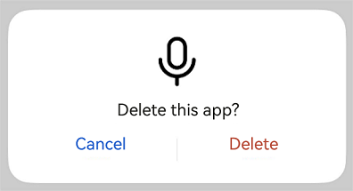
This example shows a dialog box with an image above and text below.
```ts
import { TipsDialog } from '@kit.ArkUI';
import { image } from '@kit.ImageKit';
@Entry
@Component
struct Index {
@State pixelMap: PixelMap | undefined = undefined;
isChecked = false;
dialogControllerImage: CustomDialogController = new CustomDialogController({
builder: TipsDialog({
imageRes: $r('sys.media.ohos_ic_public_voice'),
content:'Delete this app?',
primaryButton: {
value: 'Cancel',
action: () => {
console.info('Callback when the first button is clicked')
},
},
secondaryButton: {
value: 'Delete',
role: ButtonRole.ERROR,
action: () => {
console.info('Callback when the second button is clicked')
}
},
onCheckedChange: () => {
console.info('Callback when the checkbox is clicked')
}
}),
})
build() {
Row() {
Stack() {
Column(){
Button ("Text Below Image")
.width(96)
.height(40)
.onClick(() => {
this.dialogControllerImage.open()
})
}.margin({bottom: 300})
}.align(Alignment.Bottom)
.width('100%').height('100%')
}
.backgroundImageSize({ width: '100%', height: '100%' })
.height('100%')
}
aboutToAppear(): void {
this.getPixmapFromMedia($r('app.media.app_icon'));
}
async getPixmapFromMedia(resource: Resource) {
let unit8Array = await getContext(this)?.resourceManager?.getMediaContent({
bundleName: resource.bundleName,
moduleName: resource.moduleName,
id: resource.id
})
let imageSource = image.createImageSource(unit8Array.buffer.slice(0, unit8Array.buffer.byteLength))
this.pixelMap = await imageSource.createPixelMap({
desiredPixelFormat: image.PixelMapFormat.RGBA_8888
})
await imageSource.release()
return this.pixelMap;
}
}
```
### Example 2
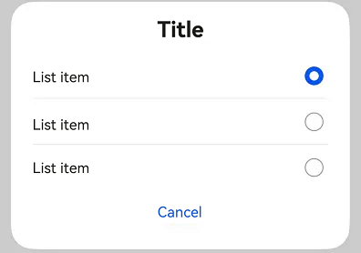
This example illustrates a dialog box that contains only a list.
```ts
import { SelectDialog } from '@kit.ArkUI'
@Entry
@Component
struct Index {
radioIndex = 0;
dialogControllerList: CustomDialogController = new CustomDialogController({
builder: SelectDialog({
title:'Title',
selectedIndex: this.radioIndex,
confirm: {
value: 'Cancel',
action: () => {},
},
radioContent: [
{
title: 'List item',
action: () => {
this.radioIndex = 0
}
},
{
title: 'List item',
action: () => {
this.radioIndex = 1
}
},
{
title: 'List item',
action: () => {
this.radioIndex = 2
}
},
]
}),
})
build() {
Row() {
Stack() {
Column() {
Button("List Dialog Box")
.width(96)
.height(40)
.onClick(() => {
this.dialogControllerList.open()
})
}.margin({ bottom: 300 })
}.align(Alignment.Bottom)
.width('100%').height('100%')
}
.backgroundImageSize({ width: '100%', height: '100%' })
.height('100%')
}
}
```
### Example 3
This example demonstrates a dialog box with text and check boxes.
```ts
import { ConfirmDialog } from '@kit.ArkUI'
@Entry
@Component
struct Index {
isChecked = false;
dialogControllerCheckBox: CustomDialogController = new CustomDialogController({
builder: ConfirmDialog({
title:'Title',
content: 'This is where content is displayed. This is where content is displayed.',
isChecked: this.isChecked,
checkTips:'Don't ask again after denying',
primaryButton: {
value: 'Deny',
action: () => {},
},
secondaryButton: {
value: 'Allow',
action: () => {
this.isChecked = false
console.info('Callback when the second button is clicked')
}
},
onCheckedChange: () => {
console.info('Callback when the checkbox is clicked')
},
}),
autoCancel: true,
alignment: DialogAlignment.Bottom
})
build() {
Row() {
Stack() {
Column(){
Button ("Text + Check Box Dialog Box")
.width(96)
.height(40)
.onClick(() => {
this.dialogControllerCheckBox.open()
})
}.margin({bottom: 300})
}.align(Alignment.Bottom)
.width('100%').height('100%')
}
.backgroundImageSize({ width: '100%', height: '100%' })
.height('100%')
}
}
```
### Example 4
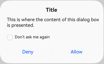
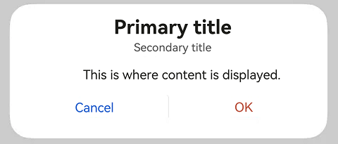
This example shows a dialog box that only contains text.
```ts
import { AlertDialog } from '@kit.ArkUI'
@Entry
@Component
struct Index {
dialogControllerConfirm: CustomDialogController = new CustomDialogController({
builder: AlertDialog({
primaryTitle: 'Primary title',
secondaryTitle: 'Secondary title',
content: 'This is where content is displayed.',
primaryButton: {
value: 'Cancel',
action: () => {
},
},
secondaryButton: {
value: 'OK',
role: ButtonRole.ERROR,
action: () => {
console.info('Callback when the second button is clicked')
}
},
}),
})
build() {
Row() {
Stack() {
Column() {
Button("Text Dialog Box")
.width(96)
.height(40)
.onClick(() => {
this.dialogControllerConfirm.open()
})
}.margin({ bottom: 300 })
}.align(Alignment.Bottom)
.width('100%').height('100%')
}
.backgroundImageSize({ width: '100%', height: '100%' })
.height('100%')
}
}
```
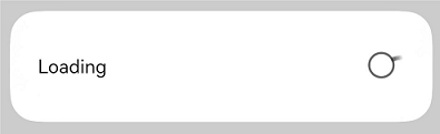
### Example 5
This example showcases the use of a progress bar in a dialog box.
```ts
import { LoadingDialog } from '@kit.ArkUI'
@Entry
@Component
struct Index {
dialogControllerProgress: CustomDialogController = new CustomDialogController({
builder: LoadingDialog({
content: 'This is where content is displayed.',
}),
})
build() {
Row() {
Stack() {
Column() {
Button ("Progress Dialog Box")
.width(96)
.height(40)
.onClick(() => {
this.dialogControllerProgress.open()
})
}.margin({ bottom: 300 })
}.align(Alignment.Bottom)
.width('100%').height('100%')
}
.backgroundImageSize({ width: '100%', height: '100%' })
.height('100%')
}
}
```
### Example 6
This example presents a dialog box that follows the specified theme style.
```ts
import { CustomColors, CustomTheme, LoadingDialog } from '@kit.ArkUI'
class CustomThemeImpl implements CustomTheme {
colors?: CustomColors;
constructor(colors: CustomColors) {
this.colors = colors;
}
}
class CustomThemeColors implements CustomColors {
fontPrimary = '#ffd0a300';
iconSecondary = '#ffd000cd';
}
@Entry
@Component
struct Index {
@State customTheme: CustomTheme = new CustomThemeImpl(new CustomThemeColors());
dialogController: CustomDialogController = new CustomDialogController({
builder: LoadingDialog({
content: 'text',
theme: this.customTheme,
})
});
build() {
Row() {
Stack() {
Column() {
Button('dialog')
.width(96)
.height(40)
.onClick(() => {
this.dialogController.open();
})
}.margin({ bottom: 300 })
}.align(Alignment.Bottom)
.width('100%').height('100%')
}
.backgroundImageSize({ width: '100%', height: '100%' })
.height('100%')
}
}
```

### Example 7
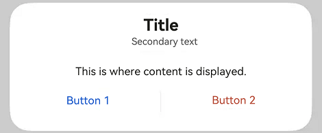
This example implements a custom dialog box.
```ts
import { CustomContentDialog } from '@kit.ArkUI'
@Entry
@Component
struct Index {
dialogController: CustomDialogController = new CustomDialogController({
builder: CustomContentDialog({
primaryTitle: 'Primary title',
secondaryTitle: 'Secondary title',
contentBuilder: () => {
this.buildContent();
},
buttons: [{ value: 'Button 1', buttonStyle: ButtonStyleMode.TEXTUAL, action: () => {
console.info('Callback when the button is clicked')
} }, { value: 'Button 2', buttonStyle: ButtonStyleMode.TEXTUAL, role: ButtonRole.ERROR }],
}),
});
build() {
Column() {
Button ("Dialog Box with Custom Content")
.onClick(() => {
this.dialogController.open()
})
}
.width('100%')
.height('100%')
.justifyContent(FlexAlign.Center)
}
@Builder
buildContent(): void {
Column() {
Text('Content area')
}
}
}
```