# Chip
The chip component is typically used in the search box history or email address list.
> **NOTE**
>
> This component is supported since API version 11. Updates will be marked with a superscript to indicate their earliest API version.
## Child Components
Not supported
## Chip
Chip({options:ChipOptions})
**Decorator**: @Builder
**Atomic service API**: This API can be used in atomic services since API version 12.
**System capability**: SystemCapability.ArkUI.ArkUI.Full
**Parameters**
| Name | Type | Mandatory| Decorator| Description |
| ------- | --------------------------- | ---- | ---------- | -------------------- |
| options | [ChipOptions](#chipoptions) | Yes | @Builder | Parameters of the chip.|
## ChipOptions
Defines the type and style parameters of the chip.
**Atomic service API**: This API can be used in atomic services since API version 12.
**System capability**: SystemCapability.ArkUI.ArkUI.Full
| Name | Type | Mandatory| Description |
| --------------- | ------------------------------------------------------------ | ---- | ------------------------------------------------------------ |
| size | [ChipSize](#chipsize) \| [SizeOptions](ts-types.md#sizeoptions) | No | Size of the chip.
Default value: **ChipSize**: **ChipSize.NORMAL**
If of the SizeOptions type, this parameter cannot be set in percentage.|
| enabled | boolean | No | Whether the chip can be selected.
Default value: **true**|
| activated12+ | boolean | No | Whether the chip is activated.
Default value: **false** |
| prefixIcon | [PrefixIconOptions](#prefixiconoptions) | No | Prefix icon of the chip.|
| prefixSymbol12+ | [ChipSymbolGlyphOptions](#chipsymbolglyphoptions12) | No | Symbol-type prefix icon of the chip.|
| label | [LabelOptions](#labeloptions) | Yes | Text of the chip. |
| suffixIcon | [SuffixIconOptions](#suffixiconoptions) | No | Suffix icon of the chip.|
| suffixSymbol12+ | [ChipSymbolGlyphOptions](#chipsymbolglyphoptions12) | No | Symbol-type suffix icon of the chip.|
| backgroundColor | [ResourceColor](ts-types.md#resourcecolor) | No | Background color of the chip.
Default value: **$r('sys.color.ohos_id_color_button_normal').**|
| activatedBackgroundColor12+ | [ResourceColor](ts-types.md#resourcecolor) | No | Background color of the chip when it is activated.
Default value: **$r('sys.color.ohos_id_color_emphasize').**|
| borderRadius | [Dimension](ts-types.md#dimension10) | No | Border radius of the chip. This parameter cannot be set in percentage.
Default value: **$r('sys.float.ohos_id_corner_radius_button')**|
| allowClose | boolean | No | Whether to show the close icon.
Default value: **true** |
| onClose | ()=>void | No | Event triggered when the close icon is clicked.|
| onClicked12+ | ()=>void | No | Event triggered when the chip is clicked. |
| direction12+ | [Direction](ts-appendix-enums.md#direction) | No| Layout direction.
Default value: **Direction.Auto**|
> **NOTE**
>
> 1. When **suffixSymbol** is provided with an argument, **suffixIcon** and **allowClose** will not take effect. If **suffixSymbol** is not provided, but **suffixIcon** is, **allowClose** still will not take effect. When neither **suffixSymbol** nor **suffixIcon** is provided with arguments, **allowClose** determines whether the deletion icon is displayed.
>
> 2. If **undefined** is assigned to **backgroundColor** or **activatedBackgroundColor**, the default background color is used. If an invalid value is specified, the background color is transparent.
>
> 3. Default font colors for **prefixSymbol** and **suffixSymbol**: **normalFontColor**: **[$r('sys.color.ohos_id_color_primary')]**; **activatedFontColor**: **[$r('sys.color.ohos_id_color_text_primary_contrary')]**. The default value of **fontColor** is **16**.
>
> 4. The default value of **fillColor** is **$r('sys.color.ohos_id_color_secondary')** for **prefixIcon** and **$r('sys.color.ohos_id_color_primary')** for **suffixIcon**. The color parsing of **fillColor** is the same as that of the **\** component.
>
> 5. The default value of **activatedFillColor** is **$r('sys.color.ohos_id_color_text_primary_contrary')** for **prefixIcon** and **$r('sys.color.ohos_id_color_text_primary_contrary')** for **suffixIcon**. The color parsing of **activatedFillColor** is the same as that of the **\** component.
## ChipSize
Defines the size type of the chip.
**Atomic service API**: This API can be used in atomic services since API version 12.
**System capability**: SystemCapability.ArkUI.ArkUI.Full
| Name | Value | Description |
| ------ | -------- | ------------------ |
| NORMAL | "NORMAL" | Normal size.|
| SMALL | "SMALL" | Small size. |
## IconCommonOptions
Defines the common icon attributes of the chip.
**Atomic service API**: This API can be used in atomic services since API version 12.
**System capability**: SystemCapability.ArkUI.ArkUI.Full
| Name | Type | Mandatory| Description |
| --------- | ------------------------------------------ | ---- | ------------------------------------------------------------ |
| src | [ResourceStr](ts-types.md#resourcestr) | Yes | Icon source, which can be a specific image path or an image reference.|
| size | [SizeOptions](ts-types.md#sizeoptions) | No | Icon size. This parameter cannot be set in percentage.
Default value: **{width: 16,height: 16}**|
| fillColor | [ResourceColor](ts-types.md#resourcecolor) | No | Icon fill color.|
| activatedFillColor12+ | [ResourceColor](ts-types.md#resourcecolor) | No | Icon fill color when the chip is activated. |
> **NOTE**
>
> **fillColor** and **activatedFillColor** take effect only when the icon format is SVG.
>
## PrefixIconOptions
Defines the attributes of the prefix icon.
Inherits from [IconCommonOptions](#iconcommonoptions).
**Atomic service API**: This API can be used in atomic services since API version 12.
**System capability**: SystemCapability.ArkUI.ArkUI.Full
## SuffixIconOptions
Defines the attributes of the suffix icon.
Inherits from [IconCommonOptions](#iconcommonoptions).
**Atomic service API**: This API can be used in atomic services since API version 12.
**System capability**: SystemCapability.ArkUI.ArkUI.Full
| Name | Type | Mandatory| Description |
| ------ | ---------- | ---- | ------------------ |
| action | () => void | No | Action of the suffix icon.|
## ChipSymbolGlyphOptions12+
Defines the options for prefix and suffix icons.
**Atomic service API**: This API can be used in atomic services since API version 12.
**System capability**: SystemCapability.ArkUI.ArkUI.Full
| Name | Type | Mandatory| Description |
| ------ | ---------- | ---- | ------------------ |
| normal | [SymbolGlyphModifier](ts-universal-attributes-attribute-modifier.md) | No | Icon setup event.|
| activated | [SymbolGlyphModifier](ts-universal-attributes-attribute-modifier.md) | No | Icon setup event when the icon is activated.|
> **NOTE**
>
> Modifying the animation type with **symbolEffect** and setting the animation with **effectStrategy** are not supported.
>
## LabelOptions
Defines the text attributes of the chip.
**Atomic service API**: This API can be used in atomic services since API version 12.
**System capability**: SystemCapability.ArkUI.ArkUI.Full
| Name | Type | Mandatory| Description |
| ----------- | ------------------------------------------ | ---- | ------------------------------------------------------------ |
| text | string | Yes | Text content.|
| fontSize | [Dimension](ts-types.md#dimension10) | No | Font size. This parameter cannot be set in percentage.
Default value: **$r('sys.float.ohos_id_text_size_button2')**|
| fontColor | [ResourceColor](ts-types.md#resourcecolor) | No | Font color.
Default value: **$r('sys.color.ohos_id_color_text_primary')**|
| activatedFontColor12+ | [ResourceColor](ts-types.md#resourcecolor) | No | Font color when the chip is activated.
Default value: **$r('sys.color.ohos_id_color_text_primary_contrary').**|
| fontFamily | string | No | Font family.
Default value: **"HarmonyOS Sans"**|
| labelMargin | [LabelMarginOptions](#labelmarginoptions) | No | Spacing between the text and the left and right icons.|
| localizedLabelMargin12+ | [LocalizedLabelMarginOptions](#localizedlabelmarginoptions12) | No| Spacing between the localized text and the left and right icons.
Default value: {
start: LengthMetrics.vp(6), end: LengthMetrics.vp(6)
} |
## LabelMarginOptions
Defines the spacing between the text and the left and right icons.
**Atomic service API**: This API can be used in atomic services since API version 12.
**System capability**: SystemCapability.ArkUI.ArkUI.Full
| Name | Type | Mandatory| Description |
| ----- | ------------------------------------ | ---- | -------------------------------------- |
| left | [Dimension](ts-types.md#dimension10) | No | Spacing between the text and the left icon. This parameter cannot be set in percentage.|
| right | [Dimension](ts-types.md#dimension10) | No | Spacing between the text and the right icon. This parameter cannot be set in percentage.|
## LocalizedLabelMarginOptions12+
Defines the spacing between the localized text and the left and right icons.
**Atomic service API**: This API can be used in atomic services since API version 12.
**System capability**: SystemCapability.ArkUI.ArkUI.Full
| Name | Type | Mandatory| Description |
| ----- | ------------------------------------------------------------ | ---- | -------------------------------------- |
| start | [LengthMetrics](../js-apis-arkui-graphics.md#lengthmetrics12) | No | Spacing between the text and the left icon. This parameter cannot be set in percentage.|
| end | [LengthMetrics](../js-apis-arkui-graphics.md#lengthmetrics12) | No | Spacing between the text and the right icon. This parameter cannot be set in percentage.|
## Example
### Example 1
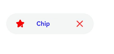
This example defines a custom chip for the deletion icon.
```ts
import { Chip, ChipSize } from '@kit.ArkUI';
@Entry
@Component
struct Index {
build() {
Column({ space: 10 }) {
Chip({
prefixIcon: {
src: $r('app.media.chips'),
size: { width: 16, height: 16 },
fillColor: Color.Red
},
label: {
text: "Chip",
fontSize: 12,
fontColor: Color.Blue,
fontFamily: "HarmonyOS Sans",
labelMargin: { left: 20, right: 30 }
},
suffixIcon: {
src: $r('app.media.close'),
size: { width: 16, height: 16 },
fillColor: Color.Red
},
size: ChipSize.NORMAL,
allowClose: false,
enabled: true,
backgroundColor: $r('sys.color.ohos_id_color_button_normal'),
borderRadius: $r('sys.float.ohos_id_corner_radius_button')
})
}
}
}
```
### Example 2
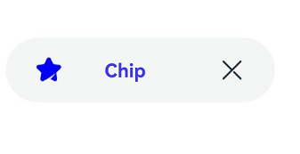
This example implements the default chip for the deletion icon.
```ts
import { Chip, ChipSize } from '@kit.ArkUI';
@Entry
@Component
struct Index {
build() {
Column({ space: 10 }) {
Chip({
prefixIcon: {
src: $r('app.media.chips'),
size: { width: 16, height: 16 },
fillColor: Color.Blue
},
label: {
text: "Chip",
fontSize: 12,
fontColor: Color.Blue,
fontFamily: "HarmonyOS Sans",
labelMargin: { left: 20, right: 30 }
},
size: ChipSize.NORMAL,
allowClose: true,
enabled: true,
backgroundColor: $r('sys.color.ohos_id_color_button_normal'),
borderRadius: $r('sys.float.ohos_id_corner_radius_button')
})
}
}
}
```
### Example 3
This example shows how to hide the chip for the deletion icon.
```ts
import { Chip, ChipSize } from '@kit.ArkUI';
@Entry
@Component
struct Index {
build() {
Column({ space: 10 }) {
Chip({
prefixIcon: {
src: $r('app.media.chips'),
size: { width: 16, height: 16 },
fillColor: Color.Blue
},
label: {
text: "Chip",
fontSize: 12,
fontColor: Color.Blue,
fontFamily: "HarmonyOS Sans",
labelMargin: { left: 20, right: 30 }
},
size: ChipSize.SMALL,
allowClose: false,
enabled: true,
backgroundColor: $r('sys.color.ohos_id_color_button_normal'),
borderRadius: $r('sys.float.ohos_id_corner_radius_button'),
onClose:()=>{
console.log("chip on close")
}
})
}
}
}
```

### Example 4
This example implements a chip in the activated state.
```ts
import { Chip, ChipSize } from '@kit.ArkUI';
@Entry
@Component
struct Index {
@State isActivated: boolean = false
build() {
Column({ space: 10 }) {
Chip({
prefixIcon: {
src: $r('app.media.chips'),
size: { width: 16, height: 16 },
fillColor: Color.Blue,
activatedFillColor: $r('sys.color.ohos_id_color_text_primary_contrary')
},
label: {
text: "Chip",
fontSize: 12,
fontColor: Color.Blue,
activatedFontColor: $r('sys.color.ohos_id_color_text_primary_contrary'),
fontFamily: "HarmonyOS Sans",
labelMargin: { left: 20, right: 30 }
},
size: ChipSize.NORMAL,
allowClose: true,
enabled: true,
activated: this.isActivated,
backgroundColor: $r('sys.color.ohos_id_color_button_normal'),
activatedBackgroundColor: $r('sys.color.ohos_id_color_emphasize'),
borderRadius: $r('sys.float.ohos_id_corner_radius_button'),
onClose:()=>{
console.log("chip on close")
},
onClicked:()=>{
console.log("chip on clicked")
}
})
Button('Activate/Deactivate').onClick(()=>{
this.isActivated = !this.isActivated
})
}
}
}
```

### Example 5
This example implements symbol-type prefix and suffix icons for the **Chip** component.
```ts
import { Chip, ChipSize, SymbolGlyphModifier } from '@kit.ArkUI';
@Entry
@Component
struct Index {
@State isActivated: boolean = false
build() {
Column({ space: 10 }) {
Chip({
prefixIcon: {
src: $r('app.media.chips'),
size: { width: 16, height: 16 },
fillColor: Color.Blue,
activatedFillColor: $r('sys.color.ohos_id_color_text_primary_contrary')
},
prefixSymbol: {
normal: new SymbolGlyphModifier($r('sys.symbol.ohos_star')).fontSize(16).fontColor([Color.Green]),
activated: new SymbolGlyphModifier($r('sys.symbol.ohos_star')).fontSize(16).fontColor([Color.Red]),
},
label: {
text: "Chip",
fontSize: 12,
fontColor: Color.Blue,
activatedFontColor: $r('sys.color.ohos_id_color_text_primary_contrary'),
fontFamily: "HarmonyOS Sans",
labelMargin: { left: 20, right: 30 },
},
size: ChipSize.NORMAL,
allowClose: true,
enabled: true,
activated: this.isActivated,
backgroundColor: $r('sys.color.ohos_id_color_button_normal'),
activatedBackgroundColor: $r('sys.color.ohos_id_color_emphasize'),
borderRadius: $r('sys.float.ohos_id_corner_radius_button'),
onClose:()=>{
console.log("chip on close")
},
onClicked:()=>{
console.log("chip on clicked")
}
})
Button('Activate/Deactivate').onClick(()=>{
this.isActivated = !this.isActivated
})
}
}
}
```

### Example 6
This example mirrors the layout of the **Chip** component.
```ts
import { Chip, ChipSize,LengthMetrics } from '@kit.ArkUI';
@Entry
@Component
struct ChipPage {
build() {
Column() {
Chip({
direction: Direction.Rtl,
prefixIcon: {
src: $r('app.media.chips'),
size: { width: 16, height: 16 },
fillColor: Color.Red,
},
label: {
text: "Chip",
fontSize: 12,
fontColor: Color.Blue,
fontFamily: "HarmonyOS Sans",
localizedLabelMargin: { start: LengthMetrics.vp(20), end: LengthMetrics.vp(20) },
},
suffixIcon: {
src: $r('app.media.close'),
size: { width: 16, height: 16 },
fillColor: Color.Red,
},
size: ChipSize.NORMAL,
allowClose: false,
enabled: true,
backgroundColor: $r('sys.color.ohos_id_color_button_normal'),
borderRadius: $r('sys.float.ohos_id_corner_radius_button')
})
}.justifyContent(FlexAlign.Center)
.width('100%')
.height('100%')
}
}
```